EPIMODELS - Stata module for epidemiological models and simulations
Description
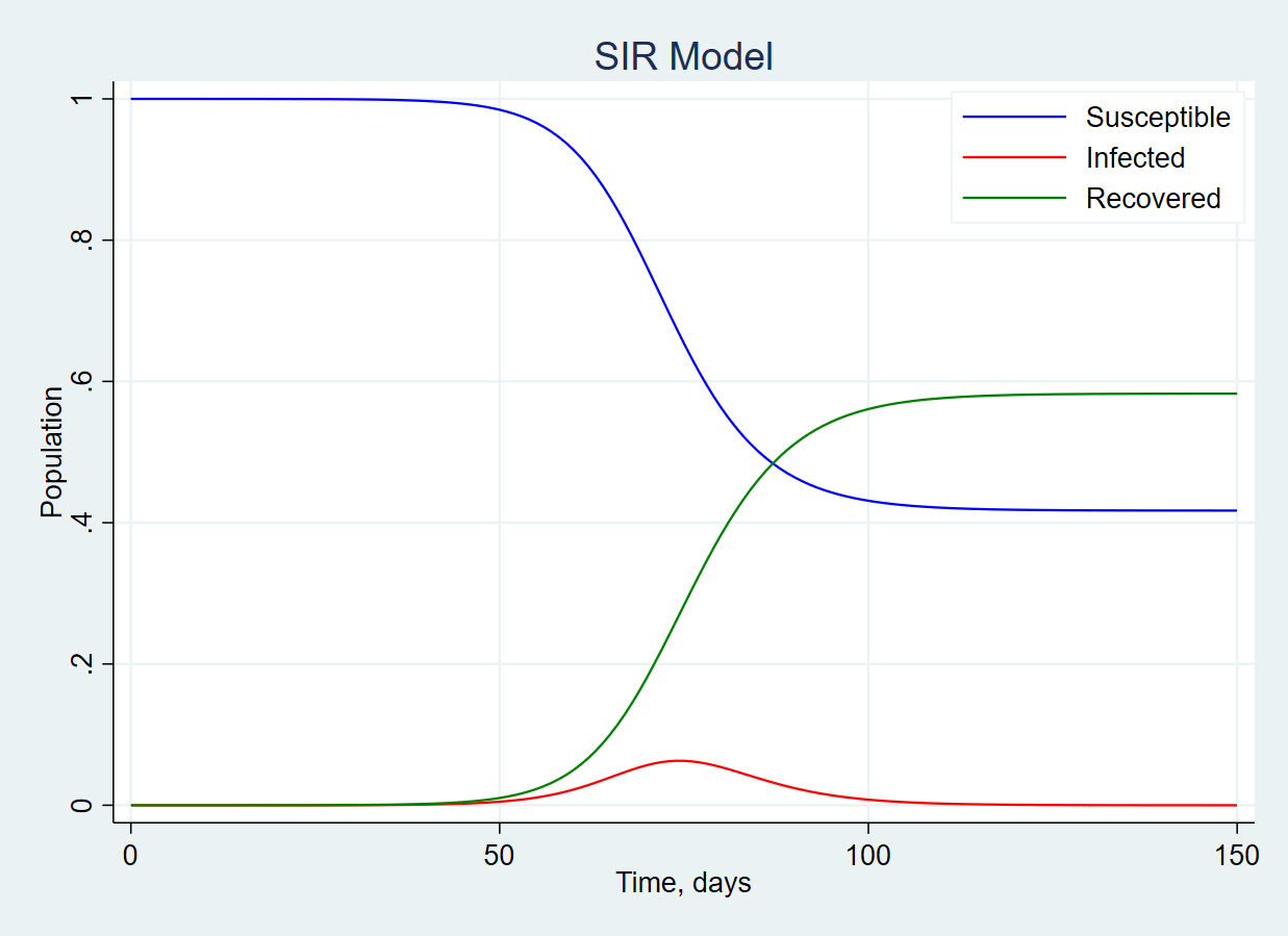
EPIMODELS simulates SIR and SEIR epidemiological models.
EPIMODELS provides interactive dialogs, which can be of an advantage for novice users, and also can be called from the users' do and ado-files for massive or repetitive jobs.
Installation
Stata 16.0 or newer is required for epimodels.
To install epimodels type literally the following in Stata's command prompt:
ssc install epimodels
Update
To update epimodels (after it is installed) type literally the following in Stata's command prompt:
ado update epimodels, update
Uninstallation
To uninstall epimodels type literally the following in Stata's command prompt:
ssc uninstall epimodels
Usage
To call the SIR-model type the following in the Stata command line:
db epi_sir
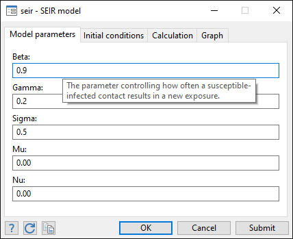
To call the SEIR-model type the following in the Stata command line:
db epi_seir
Both models generate new variables storing the model data. Typically it makes sense to clear memory before calling the model dialog (or specify option clear in the command line).
Gallery and Examples
Black-and-white chart
epimodels produces output using standard Stata's graphing commands. To produce output optimized for the black-and-white publications, specify a corresponding scheme, e.g. s2monochrome. This will cause all colors to be turned to shades of gray, and various line patterns applied to differentiate between the lines.

 epi_sir, days(100) clear ///
          beta(0.5) gamma(0.33333) ///
          susceptible(60.4e+06) infected(100) ///
          scheme("s2mono") scale(0.75)
N.B. the value 60.4e+06 is equivalent of 60.4mln (60,400,000) in Stata's notation.
Rotating labels for axes scales
We can easily adjust the direction of labels by controlling the angle of labels at each axis, note the angle(#) option:

 epi_sir, days(100) day0(2020-02-01) clear ///
          beta(0.5) gamma(0.33333) ///
          susceptible(60.4e+06) infected(100) ///
          xlabel(,angle(33)) ylabel(,angle(0)) ///
          scale(0.75) graphregion(color(white))
N.B. the value 60.4e+06 is equivalent of 60.4mln (60,400,000) in Stata's notation.
Peak detection
Model charts are often supplemented with the illustration of the peak of infected.

do "https://raw.githubusercontent.com/radyakin/epimodels/master/demo/demo2.do"
The strategy in this example is to perform the first model run without displaying any results, solely to obtain the peak values, then perform a second run already plotting the results and overlaying with the peak illustration.
One can equally run a model with or without the graphing, then build another graph with peak illustration by own code.
Effect of parameter β in the SIR model
As illustrated in the following chart, higher values of β correspond to higher peaks of the infected group, holding other parameters constant.

do "https://raw.githubusercontent.com/radyakin/epimodels/master/demo/demo3.do"
In this example we run multiple simulations of the same model varying just one parameter (β) and then plotting the results all together at the same chart.
Epidemics profile
Given that the overall population is fixed, plotting the size of each group in a stacked form helps understand the development of epidemics.

do "https://raw.githubusercontent.com/radyakin/epimodels/master/demo/demo4.do"
The peak value of infected can also be automatically plotted, as in this example.
Social distancing policy simulation
We can simulate the effect of the policy of social distancing, here reducing the intensity of contacts from 0.9 to 0.3.

do "https://raw.githubusercontent.com/radyakin/epimodels/master/demo/demo5.do"
The strategy here is to do a simulation with a base scenario, then do a second simulation picking from a mid-point of the simulation, but continuing with values of parameters modified by the policy. The full code is shown in this example.
Sensitivity of key indicators
In this example we look at how the day of the peak infected and the maximum number of infected are sensitive to the value of the parameter beta.

do "https://raw.githubusercontent.com/radyakin/epimodels/master/demo/demo6.do"
The strategy here is to do a simulation for a given value of gamma (0.25 in this example) and varying beta, accumulating the critical results returned by the model after every run. Then plotting just those accumulated results. The full code is shown in this example.
Note also that while beta remains smaller than gamma, the highest number of infected is the initial number (10), and so the day of the peak is 0.
Documentation and Resources
Epimodels is available for download from RePEc Ideas and RePEc EconPapers.
Announcement of the epimodels was posted to StataList on April 15, 2020 and to the World Bank Data Blog on May 05, 2020.
Additional information is available in the following vignettes:
Author
EPIMODELS was written by Sergiy Radyakin and Paolo Verme.